


Energetics of Color
the rippling impact of what you wear

In light of Pantone dropping a really uninspiring Color of the Year, I thought that I should adapt and update my Instagram series on color so that it could receive new life on Substack. You can find the original here.

This all began when I started streaming The Watcher on Netflix shortly after it aired. The layers of beige in the opening scene reminded me that I had been hoarding a few articles waiting for the optimal time to share. Having written an earlier piece on the topic of Minimalism (which I will work on reformatting for this space in the near future) and the erasure of detail and ornamentation in our public and private spaces, I wanted to touch on how we’re seeing parallel trends with the disappearance of color.
Click, click, click, if you would like me to read this to you.
THE GRAYING OF AMERICA
I instantly loved this turn of phrase when Sherwin Williams described the “graying of America” beginning in full force in the 2010s. It gives nod to the intentionality of this shift as aesthetically we saw a move from beige to gray. When flipping through their Color Through the Decades feature, it dawned on me that in the past, neutral walls were complemented by pops of colors in other ways — a chair, the appliances, some art. Over the past few decades, that’s slowly faded leaving us with gray on gray on gray or sometimes gray on beige on white. Makes you miss an avocado fridge.

While beige and neutral tones can be intentional and a distinct choice (or a plot device as we see in The Watcher or Maid In Manhattan), for many, I believe the shift to grays is made in hopes to blend. Don’t stand out. Don’t offend. Interesting how that theme has crept into our wardrobes and our homes.
Instead of these shades acting as a blank slate, they become energy voids. During my days of selling paint, one of our distributors referred to neutral beiges and whites as “teeth colors.” It stuck with me. They’re non-colors that act as a backdrop against which other colors pop.
Think of an art gallery. The walls are intentionally white so as not to detract from the art. They say, “Don’t look at me. Look over there!” So if we are choosing neutral walls, how are we accenting them and highlighting the rest of our space?
![Carlos Cruz-Diez, Labyrinthe de Transchromie, 1965/2019, 566 7/8 x 755 7/8 in. Installed in the Grand Palais for Le Biennale Paris [detail]](https://substackcdn.com/image/fetch/f_auto,q_auto:good,fl_progressive:steep/https%3A%2F%2Fsubstack-post-media.s3.amazonaws.com%2Fpublic%2Fimages%2Ffa447594-d7b4-4090-9982-75b9e967bbc3_586x580.jpeg "Carlos Cruz-Diez, Labyrinthe de Transchromie, 1965/2019, 566 7/8 x 755 7/8 in. Installed in the Grand Palais for Le Biennale Paris [detail]")
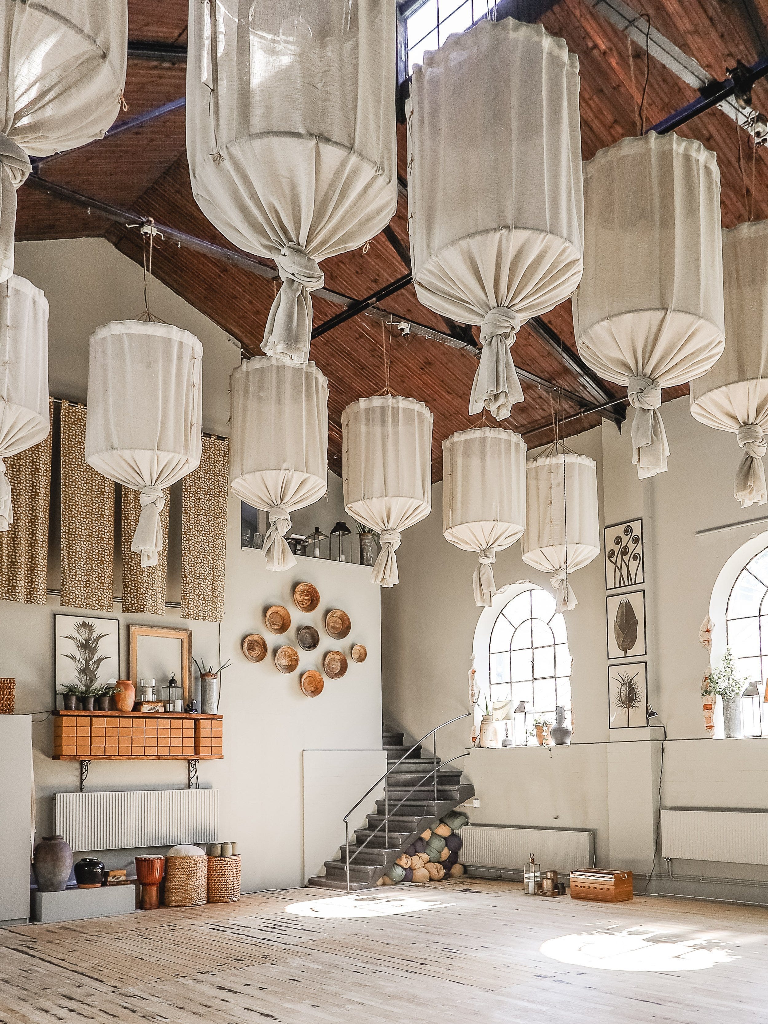
A neutral color scheme doesn’t automatically mean a space is devoid of energy either. Look at the gorgeous studio of Pure Yoga Sweden. It offers beautiful layers of creams, grays, and beiges mixed with an array of texture. Like the traditional art gallery, the studio is meant to fade into the background to bring the focus to the yoga practice while also creating an incredibly grounded and cozy atmosphere.
EMERGENCE OF COLOR
But to every movement there is typically a counter movement. Phew. This translates to a reemergence of color in select spaces. Ivy Elrod shares her interpretation behind the shift toward burgeoning color in her article Move Over, 50 Shades of Beige in which she describes how “the saturated color on display was pervasive” at the 60th anniversary of Salone del Mobile, the world’s largest furniture and design show — indicative of the direction things are heading.
Color is a power which directly influences the soul. – Wassily Kandinsky
Opening with the Kandinsky quote, “Color is a power which directly influences the soul,” Elrod offers her assessment of why we are seeing the pendulum swing to embrace more color. I encourage you to read it first hand to fully appreciate her writing and perspective, as well as enjoy a bevy of interesting links that delve further into these topics.
 by Wassily Kandinsky")
I will take this opportunity to plug Kandinsky’s Concerning the Spiritual in Art as suggested reading since I work this into conversation whenever I can. Moving on.
Elrod goes on to posit —
It would seem that the current move toward depth of color and vibrancy, and away from the minimalist, sensible Kinfolk taupe of the years leading up to the pandemic, is nothing short of a summoning for joy — a reach for nonverbal self-expression and perhaps even a bid for control.
Please tell me you love the turn of phrase “Kinfolk taupe” as much as I do? (It offers a nice alternative to “hipster beige” as I’ve often thought of it.) Elrod has such a way with words. But here’s the question, are we culturally ready to embrace color as the mood shifter it can be? Are brighter hues ahead?
Ultimately I find myself asking, do we fear color because we fear showing ourselves? As we’ve become culturally and socially muzzled, worried that we might say the wrong thing and be canceled, has that slipped into our home decor and wardrobes as well? Do we choose absence of color so as not to inadvertently offend, yet end up draining the joy from our lives instead?
Luckily there are some folks out there offering an anecdote to a colorless existence. Four of my favorites include —
HAINT BLUE
Based on the significance of color, I kept going with The Watcher even though the characters are horribly unlikable with no redeeming traits. The house itself is gorgeous, and I was convinced that Ryan Murphy was going somewhere with the hints of blue amidst the sea of beige.

Knowing his penchant for mixing the worlds of the living and the dead, I suspected the inclusion of blue might visually reference the specific shade and tradition of Haint Blue. It did not. Sadly. Spoiler, but not really. Don’t waste your time on this show. It is an active grab for evil to get its mitts on you. No need to expose yourself to that kind of thing.
Side Note: The most unbelievable aspect of The Watcher is that Naomi Watts’ character gains membership into a swanky country club without having a sponsor or being on a waitlist. And that’s where they lost me.

Back to Haint Blue. Throughout the South, porch ceilings, doors, shutters, and trim can be found painted in this tradition to keep evil spirits at bay. (You can see why I thought The Watcher might be incorporating blue into their color scheme.) Though it began as a Gullah Geechee custom, it is now widespread through many homes.

This “haint blue,” first derived from the dye produced on Lowcountry indigo plantations, was originally used by enslaved Africans, and later by the Gullah Geechee, to combat “haints” and “boo hags”—evil spirits who escaped their human forms at night to paralyze, injure, ride (the way a person might ride a horse), or even kill innocent victims. The color was said to trick haints into believing that they’ve stumbled into water (which they cannot cross) or sky (which will lead them farther from the victims they seek). Blue glass bottles were also hung in trees to trap the malevolent marauders.
– What the Color 'Haint Blue' Means to the Descendants of Enslaved Africans

What most intrigues me about this color and the tradition behind it is that energy follows intention. Therefore, knowing that Haint Blue wards off unwanted spirits will in turn keep them away. The color is forever infused with protection thanks to years of use and generations imbuing it with potency.
FUNERAL COLORS
While we’re on the topic of color and death, I find myself wondering, where did the tradition of dressing all in black for funerals come from? Not rhetorical. I’m genuinely curious about this so if you have resources, send them my way!
Dark colors, black and navy specifically, are a way to keep energy from attracting and attaching to you. Ever wonder why New York is a sea of black as folks move on and off the subway and weave around each other on the sidewalks? Intuitively, they’ve found a way to be less of an energy target.
Is this why people dress in black at funerals? I know it’s why I wore exclusively navy when I flew on multiple planes every week. Is it so that the spirit of the recently deceased and the energy of grief does not stick to them?
Brightly colored altars festooned with marigolds are fresh in my mind as my friends have been sharing photos of Día de los Muertos. But this is a celebration separate from a funeral, a remembrance. The dead are invited to come celebrate with the living.

When we gathered to celebrate my mom’s life, in lieu of a funeral, we asked that everyone wear red, fuchsia, or hot pink — her favorite colors. A human quilt as one friend put it. People were encouraged to be festive and wear clothes that brought them joy, a very different energy than a funeral of all black.
Granted, there were also cows and ice cream and pinwheels so we weren't exactly going for somber. Instead we threw a party that my mom would have loved, so many people mentioned that. I realize I know so little about the origins of the traditions of a typical funeral. What I do know is that they did not feel appropriate for our family.
When it comes to life and death and color, embrace what feels best for you. Have conversations about how you want to be remembered and celebrated before those decisions have to be made. Part of what made the gathering for my mom so special is that she had a massive hand in it, and not just because she got the cows to stand right next to the gazebo.
IN CONCLUSION
Color is a conduit. What a fantastic way to infuse or defuse energy. The question becomes do you want to move through life deflecting energy and hoping it doesn’t cling to you, or do you want to embody your energy and broadcast it out to the world? It’s up to you.
The clothes we choose, the way we style our homes, and even things as seemingly insignificant as the color pens on our desk, are all reflections of our energy. Soft neutrals tend to themselves, inviting a sense of calm. Vibrant colors not only impact your own energy body but those around you, sending a bold ripple through everything you do.

Go put your energy signature out into the world. Show up boldly if you’re so inclined. Offer the solitude of a cream colored cashmere sweater if that’s more your style. Choose color with intention and confidence. Discover what exemplifies you.